
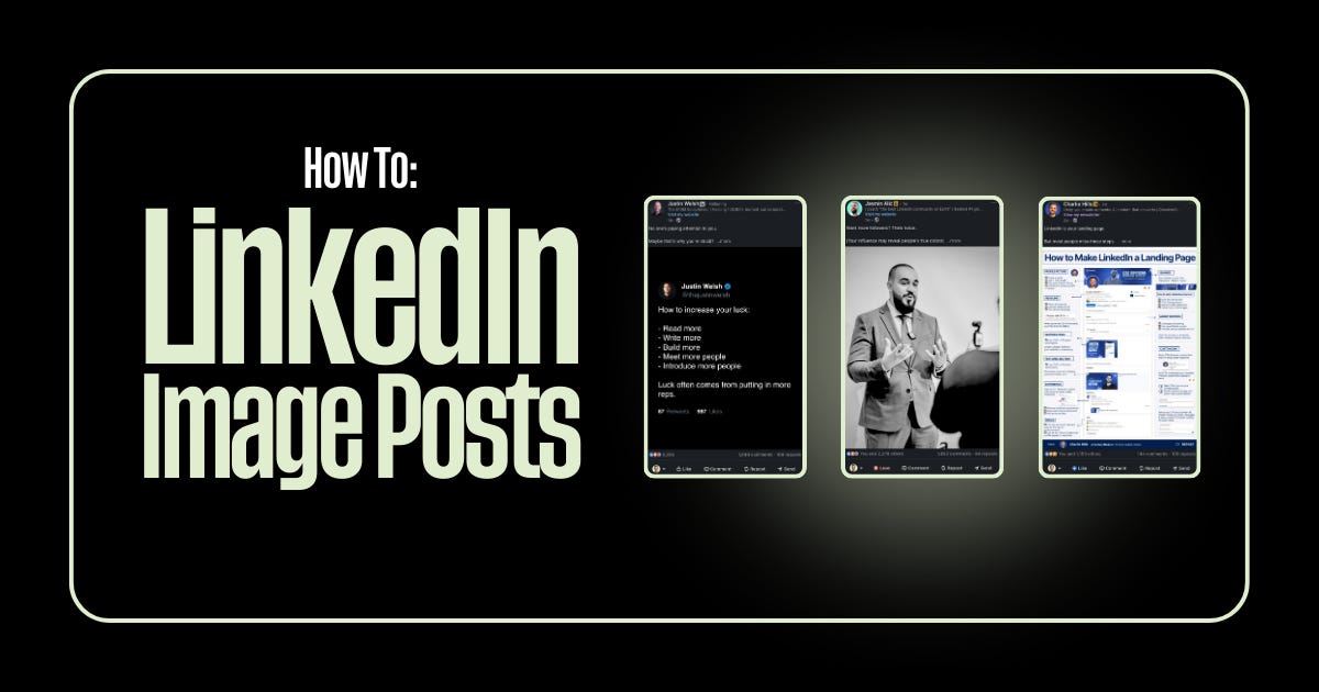
5 Image Post Types That Actually Work on LinkedIn
4 prompts that you can use to create better image posts.

Most people overthink LinkedIn images.
They spend hours in Canva, second-guess every design choice, and end up posting something generic that blends into the feed.
Here’s what I’ve learned after years of testing: there are really only 5 types of image posts that consistently perform. Master these, and you’ll never stare at a blank canvas wondering what to create.
Let me break each one down and give you an AI prompt to create them instantly.
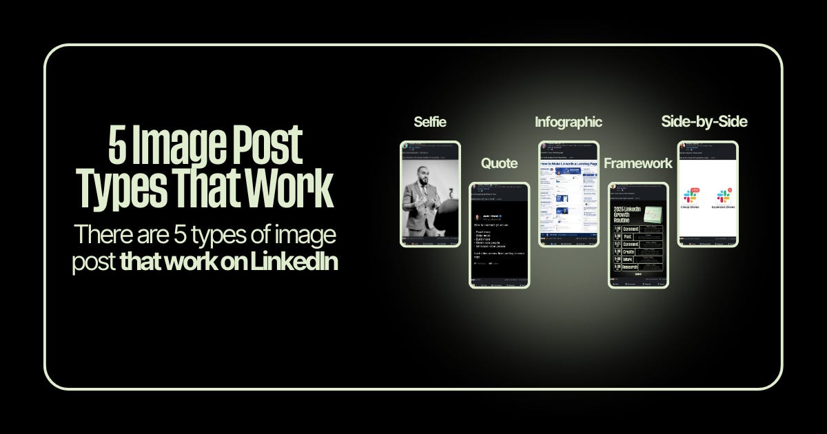
1: Selfies
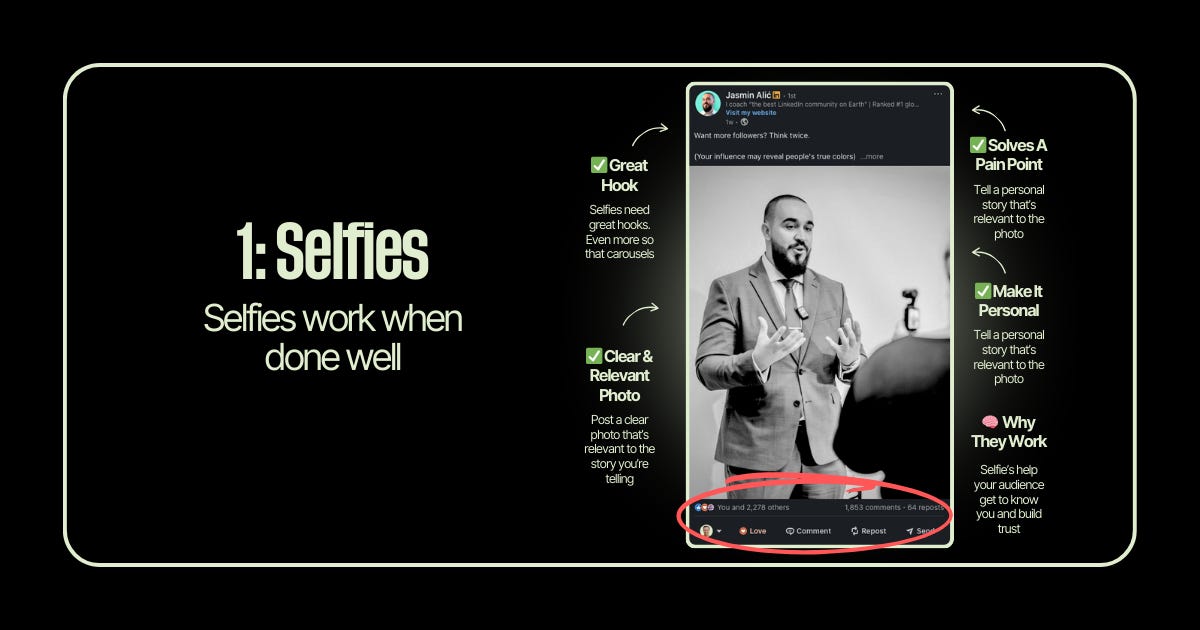
Selfies work when done well. The key word is when done well.
I’ll be honest, I resisted selfies for a long time. Felt too “influencer-y” for LinkedIn. But the data doesn’t lie. Posts with your face build trust faster than graphics can.
The secret? Your selfie needs to earn its place. Don’t just slap a random photo on a post about productivity. The image should connect to a personal story that solves a real pain point for your audience.
Why they work: Selfies help your audience get to know you. In a sea of faceless brands and stock photos, your face is a pattern interrupt. People connect with people.
The keys:
Great hook (selfies need stronger hooks than carousels)
Clear, relevant photo that connects to your story
Personal narrative that solves a pain point
Make it about them through your experience
No AI prompt for this one. Your selfies should be real photos of you. That’s the whole point … authenticity you can’t fake with AI.
2: Quotes
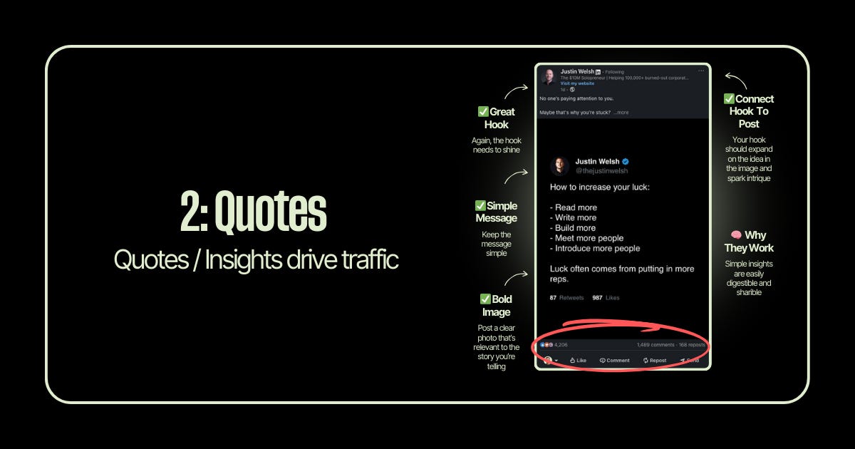
Quote graphics are engagement machines when done right.
I’ve seen simple quote posts outperform 20-slide carousels I spent hours creating. Why? Because a clean, bold insight is infinitely shareable. People save them. Screenshot them. Send them to colleagues.
The mistake most people make: they use quotes from famous people. That’s fine occasionally, but the real magic is when you become the source of quotable insights.
Why they work: Simple insights are easily digestible and shareable. They position you as a thought leader in your space.
The keys:
Hook that expands on the image’s idea
Simple, bold message (one insight, not five)
Clean visual design that stops the scroll
Your hook and image should feel connected, not random
Gemini Prompt:
Create a quote graphic, 1080 pixels wide by 1350 pixels tall. A background that looks like real paper. Display this quote in realistic, a little sloppy, handwriting style text that looks like it was written with a ballpoint pen, don’t center it the image: “Your network isn’t your net worth. Your reputation is.” Keep the design minimal and modern with generous whitespace
3: Infographics
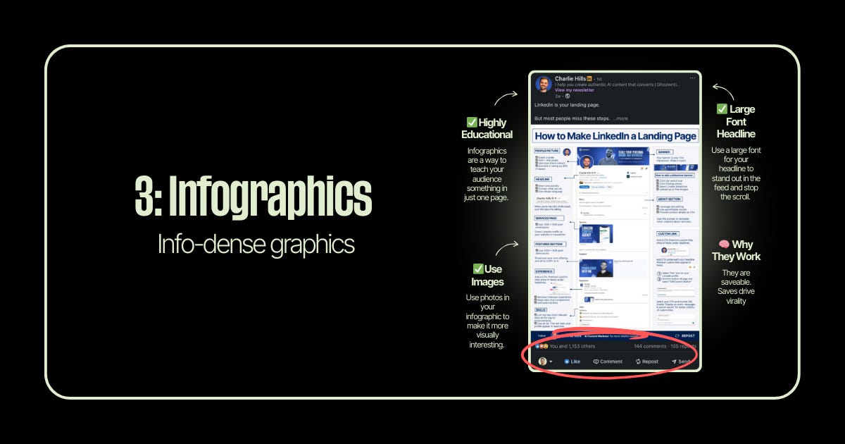
Infographics are save magnets. And saves drive virality.
When someone saves your post, LinkedIn’s algorithm interprets that as “this content has long-term value.” That signal pushes your post to more feeds.
I started creating more infographics after noticing a pattern in my analytics: my most-saved posts were always the ones that taught something in a single, dense image. People treat them like cheat sheets they can reference later.
Why they work: They’re saveable. One image that teaches your audience something valuable becomes a reference they return to.
The keys:
Highly educational (teach something complete in one image)
Large font headline that stops the scroll
Use photos/icons to make it visually interesting
Dense with value, but still scannable
Gemini Prompt:
Create an educational infographic, 1080 pixels wide by 1350 pixels tall. Title at top in large bold font: “The 5-Step Client Onboarding Framework.” Dark professional background. Use a numbered list format with icons next to each step: 1) Discovery Call 2) Proposal & Agreement 3) Kickoff Meeting 4) First Deliverable 5) Feedback Loop. Include a small headshot placeholder in the top corner. Use accent colors sparingly (one brand color for highlights). Make text highly readable with clear hierarchy.
4: Frameworks
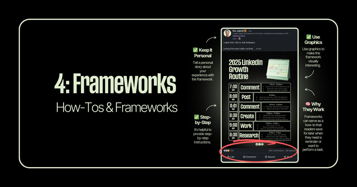
Framework posts are how-tos disguised as graphics.
I went from 10k to 40k followers using my exact daily routine and one of my best-performing posts was literally just that routine visualized as a framework graphic. People save frameworks because they want to implement them later.
The personal angle matters here too. Don’t just share a framework, share your framework. The one you actually use. That lived experience is what separates a forgettable post from one people screenshot and share.
Why they work: Frameworks serve as how-tos that readers save for later when they need a reminder or want to perform a task.
The keys:
Keep it personal (your experience with this framework)
Use graphics to make it visually interesting
Step-by-step format works best
Actionable enough to implement immediately
Gemini Prompt:
Create a framework graphic, 1080 pixels wide by 1350 pixels tall. Title: “My 2025 LinkedIn Growth Routine.” Dark background with a calendar/schedule icon in the header. Display a time-blocked schedule format: 7:30am - Comment (with brief description), 8:00am - Post, 8:01am - Engage, 8:30am - Create, 9:00am - Deep Work, 8:30pm - Research. Use a clean table or timeline layout. Include subtle icons next to each time block. Professional dark theme with one accent color for emphasis.
5: Side-by-Sides
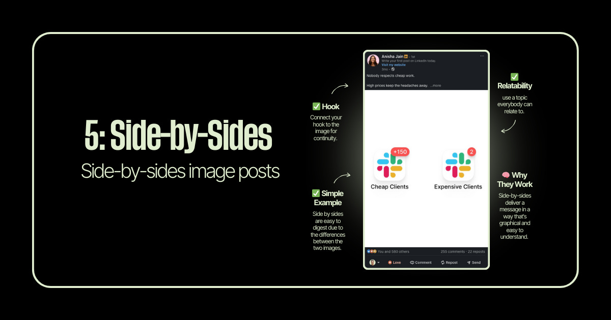
Side-by-side comparisons are instant clarity.
The human brain loves contrast. Good vs. bad. Before vs. after. Amateur vs. pro. When you put two things next to each other, the difference becomes immediately obvious—no explanation needed.
I use these when I want to make a point that’s hard to articulate in text. Sometimes showing the contrast is worth a thousand words.
Why they work: They deliver a message in a way that’s graphical and easy to understand. The visual contrast does the heavy lifting.
The keys:
Hook connects to the image
Relatable topic everyone understands
Simple, clear contrast between the two sides
Let the visual make the argument
Gemini Prompt:
Create a side-by-side comparison graphic, 1080 pixels wide by 1350 pixels tall. Left side labeled “Cheap Clients” with a Slack logo showing +150 notification badge (chaotic energy). Right side labeled “Premium Clients” with a Slack logo showing just 2 notifications (calm energy). Clean white or light background. Use subtle color coding—red/orange tones on the left, green/blue tones on the right. Modern, minimal design. The contrast should be immediately obvious at a glance.
The Bottom Line
You don’t need to reinvent the wheel with every image post.
Pick one of these five formats. Match it to your message. Execute it well.
That’s it. That’s the whole strategy.
Happy Saturday
MJ